Customization
Overview
The SDK offers a flexible and modular customization system designed to adapt to your brand identity, user needs, and accessibility standards—whether you're launching a quick integration or implementing a deeply tailored experience. A key advantage of this system is that you can start broad and refine as needed. Begin by applying global changes to colors, typography, and styles at the theme level. Then, if needed, progressively fine-tune individual components or interactive states. Each section supports partial configuration—you only need to override the values that are relevant for your use case. Any keys left undefined will automatically fall back to the SDK’s default values, ensuring robustness and ease of maintenance. This approach enables teams to deliver a cohesive, accessible, and brand-aligned experience with minimal effort, while still offering full control for advanced customization.
The sections that follow detail how to configure:
- Texts (labels, messages, instructions, accessibility strings)
- Media (illustrations and image assets per screen)
- Styles (design tokens, layout, colors, and typography)
- Components (buttons, header, spinner, and more)
With this structure, you can create a customized user experience that feels natively integrated into your product—without sacrificing speed or maintainability.
Texts
The system provides flexible control over the text content displayed throughout the interface. Instead of editing hardcoded labels or messages in multiple places, you can configure all user-facing texts from a centralized section.
Below is the full JSON structure containing all configurable text elements used throughout the interface.
You are not required to modify the entire structure. The configuration supports partial overrides; if a key is not redefined, the SDK falls back to the default value.
In general, text entries apply to both active and passive flows; however, some keys are nested under either active or passive, and those only apply to that flow type.
For example, if your integration uses active flow and you provide texts.instructions.passive.title, that text is not used. You must override texts.instructions.active.title.
Take into account that ASCII codes (for example \n) will not be interpreted and will be shown as-is. Only some HTML tags can be used in section titles and subtitles. If an unsupported tag is included, the text will be rendered as plain text.
Allowed tags:
<b></b><i></i><br/><ul></ul><li></li><ol></ol>
Example of title and subtitle with HTML inside:
"texts": {
    "instructions": {
        "passive": {
            "title": "Take a photo of <b>your face</b>",
            "subtitle": "<i>Follow these steps:</i> <ol><li><b>Frame your face</b> in the camera.</li><li><b>Keep a neutral expression</b>.</li></ol>"
        }
    }
}
| Screen | Mobile |
|---|---|
| Instructions | 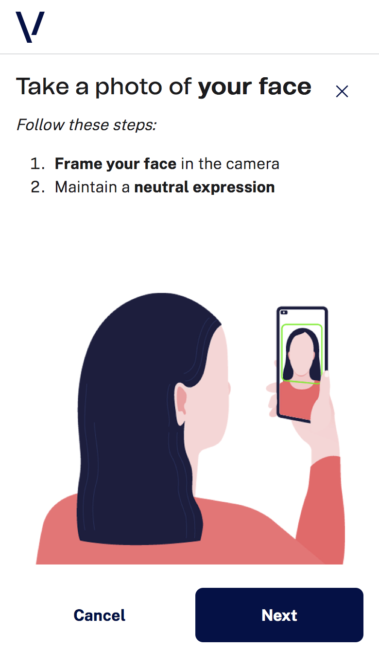 |
Recommendations
Titles and Subtitles
- Use short, direct titles that describe the expected action. ✦ Example: “Take a photo of your face”, “Turn your head in the indicated direction”
- Subtitles should clarify the instruction with additional detail. ✦ Example: “Make sure your face is centered and well lit”
- Maintain a clear hierarchy: concise title + informative subtitle.
- Avoid vague labels like “Step 1” or “Instructions”.
Feedback Messages
- Use feedback to describe progress or confirm capture. ✦ Example: “Analyzing selfie…”, “Checking movement…”, “Finalizing verification…”
- Avoid generic phrases like “Loading…” as the only feedback message.
- Error messages should be clear and constructive, not technical.
Readability and Accessibility
- Keep texts concise and left-aligned.
- Avoid excessive bold, italics or styling.
- Use simple, translatable language.
- Ensure user-facing texts work well with screen readers.
Media
The system also provides centralized control over media content.
You are not required to modify the entire structure. You can override only required media entries and keep defaults for the rest.
Example of media configuration:
"medias": {
    "instructions": {
        "mobilePassive": "https://domain.com/images/selfie_mobile.png",
        "mobileActive": "https://domain.com/images/selfie-active.gif"
    }
}
Recommendations
File format
We support image formats handled natively by the runtime. Recommended:
- Static images: WebP/JPEG/PNG.
- Animated images: GIF for short, simple animations.
File weight and performance
The larger the file size, the longer it will take to load.
Descriptive and Accessible Visuals
- Prioritize descriptive, instructional visuals.
- Include alternative text in
textsfor all media. - Keep alt text specific and actionable.
- Avoid relying only on media; keep textual redundancy.
Style
The style system is based on design tokens.
You are not required to modify the entire structure.
Three Levels of Customization
1. Theme Level (Global)
Apply global branding through:
darkTextColorbrandPrimaryColorbrandSecondaryColorfont.familyPrimaryfont.familySecondary
2. Component Level
Override specific components:
- Header
- Buttons
- Icon button
- Spinner
3. Interactive States
Define hover/pressed behavior for components.
Recommendations
Add Custom Fonts to the iOS Project
The integrating iOS app must include custom fonts in Info.plist.
Example:
<key>UIAppFonts</key>
<array>
    <string>Fonts/FONTFILE_NAME1.ttf</string>
    <string>Fonts/FONTFILE_NAME2.woff2</string>
</array>
Register fonts programmatically when needed:
if let fontURL = Bundle(for: IntegratorBundleClass.self)
        .url(forResource: "FONTFILE_NAME", withExtension: "FONTFILE_EXTENSION"),
   let provider = CGDataProvider(url: fontURL as CFURL),
   let font = CGFont(provider) {
    var error: Unmanaged<CFError>? = nil
    CTFontManagerRegisterGraphicsFont(font, &error)
}
Colors
brandPrimaryColor: main brand color for primary actions/highlights.brandSecondaryColor: secondary accent color.darkTextColor: primary text color over light backgrounds.
Accessibility and Contrast
- Validate contrast ratios after any color change.
- Prioritize readability in body text and action buttons.
Theme Level
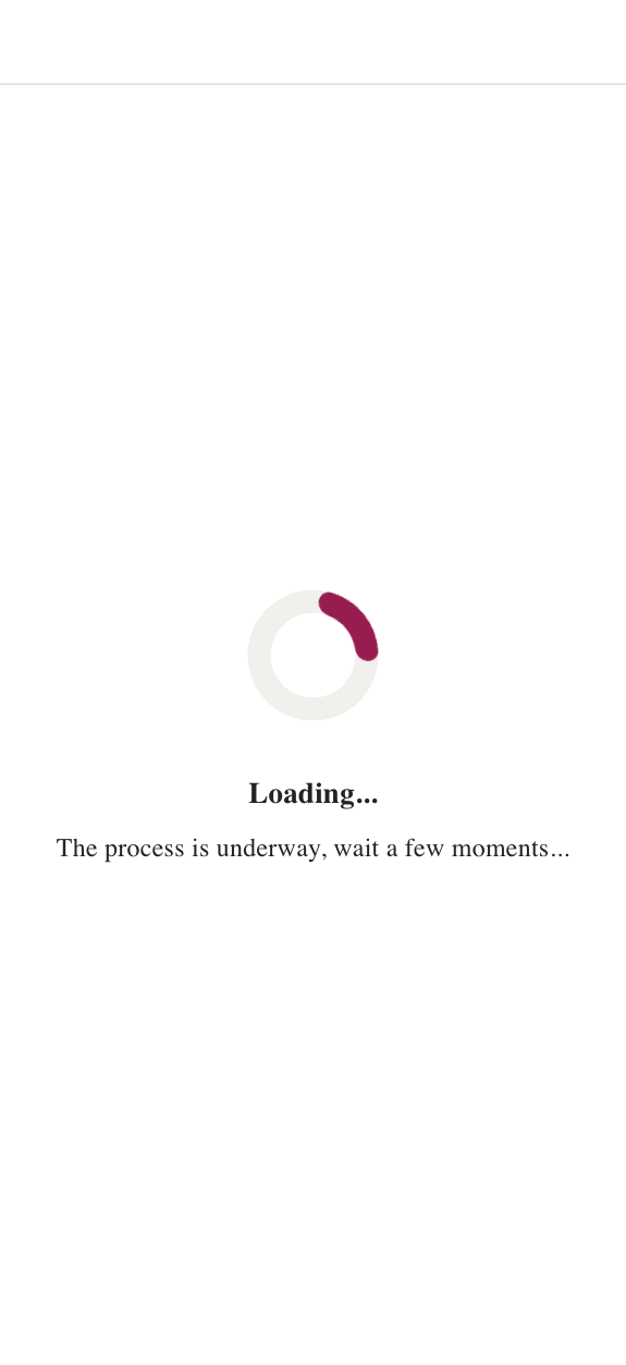
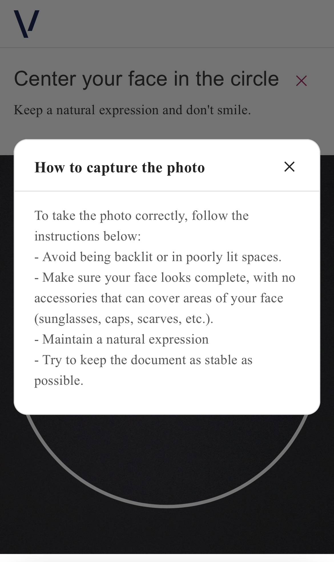
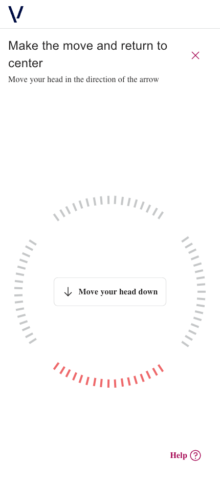
Using styles.theme, define the global design tokens:
darkTextColorbrandPrimaryColorbrandSecondaryColorfont.familyPrimaryfont.familySecondary
IMPORTANT
Any changes made here have global impact on the SDK UI.
Example:
"styles": {
    "theme": {
        "darkTextColor": "#242323",
        "brandPrimaryColor": "#A50050",
        "brandSecondaryColor": "#E5D0DA",
        "font": {
            "familyPrimary": "Arial",
            "familySecondary": "Open Sans"
        }
    }
}
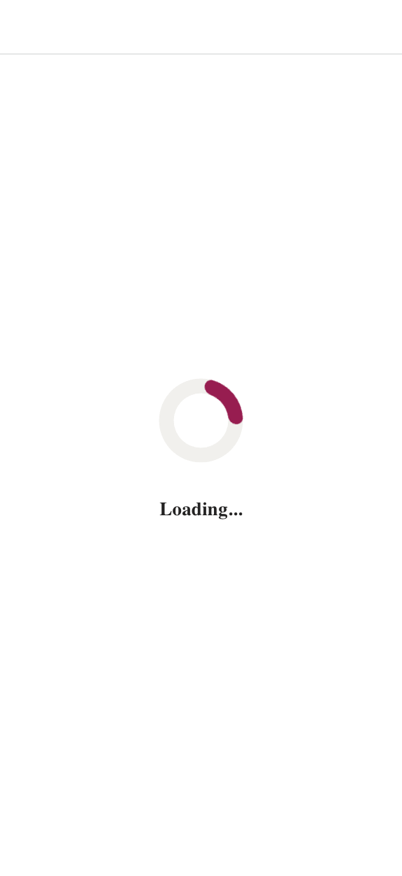
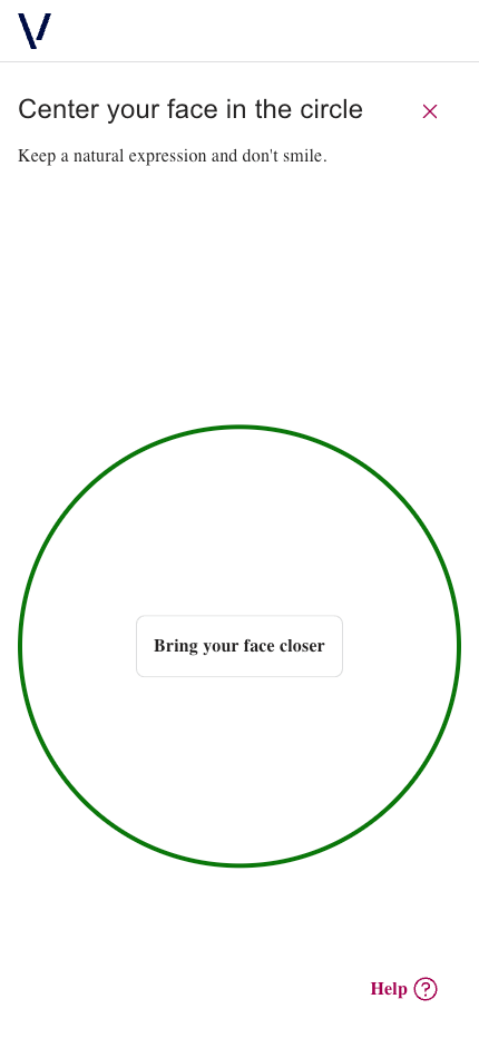
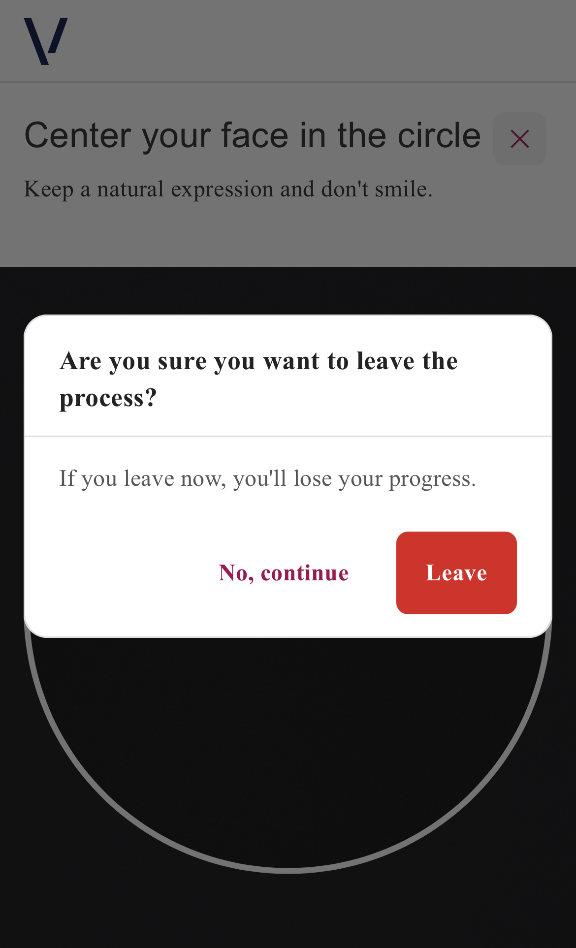
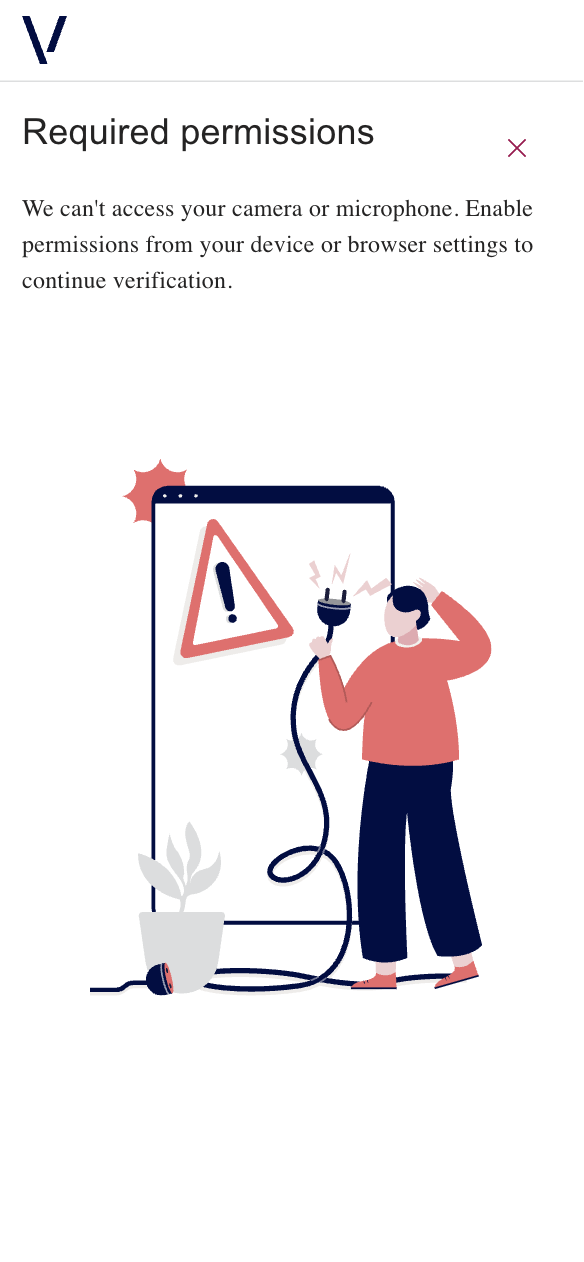
Mobile
| Default Customization | After Customization | |
|---|---|---|
| Loading | 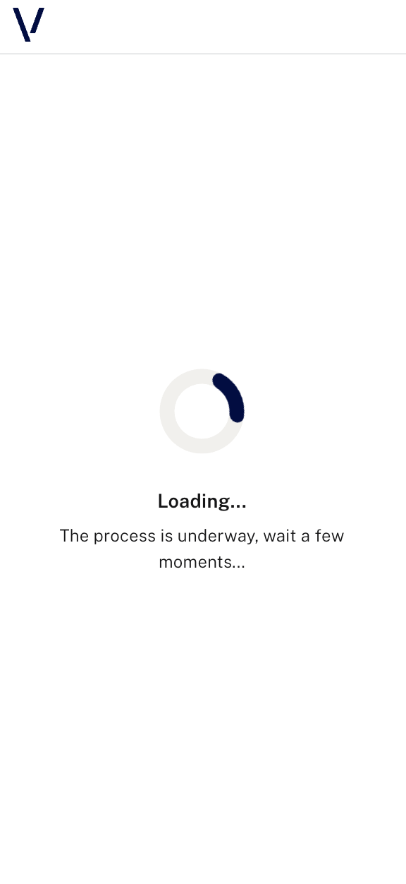 |
 |
| Instructions Passive | 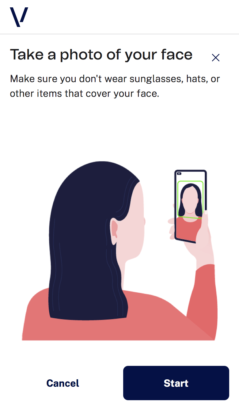 |
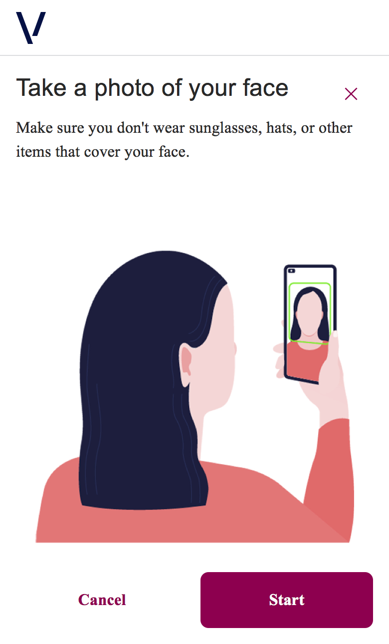 |
| Instructions Active | 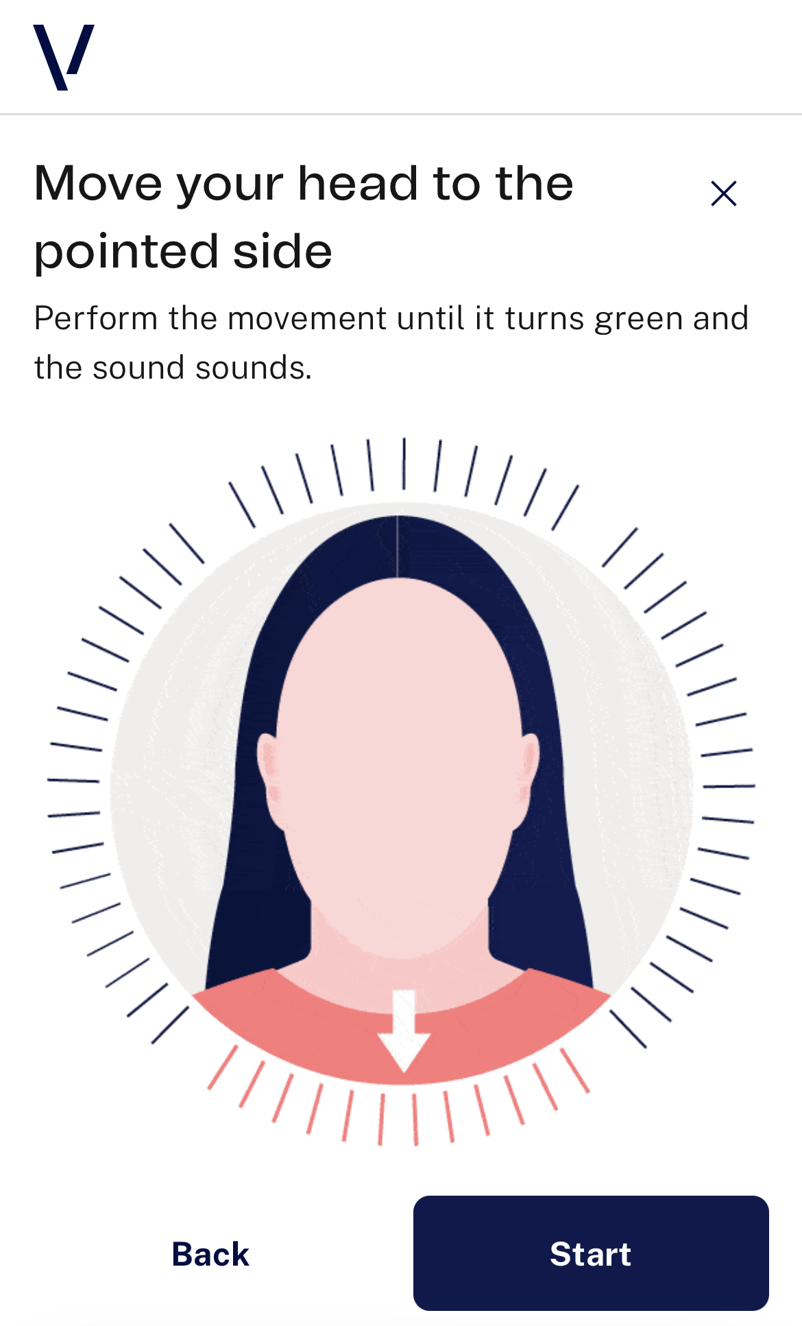 |
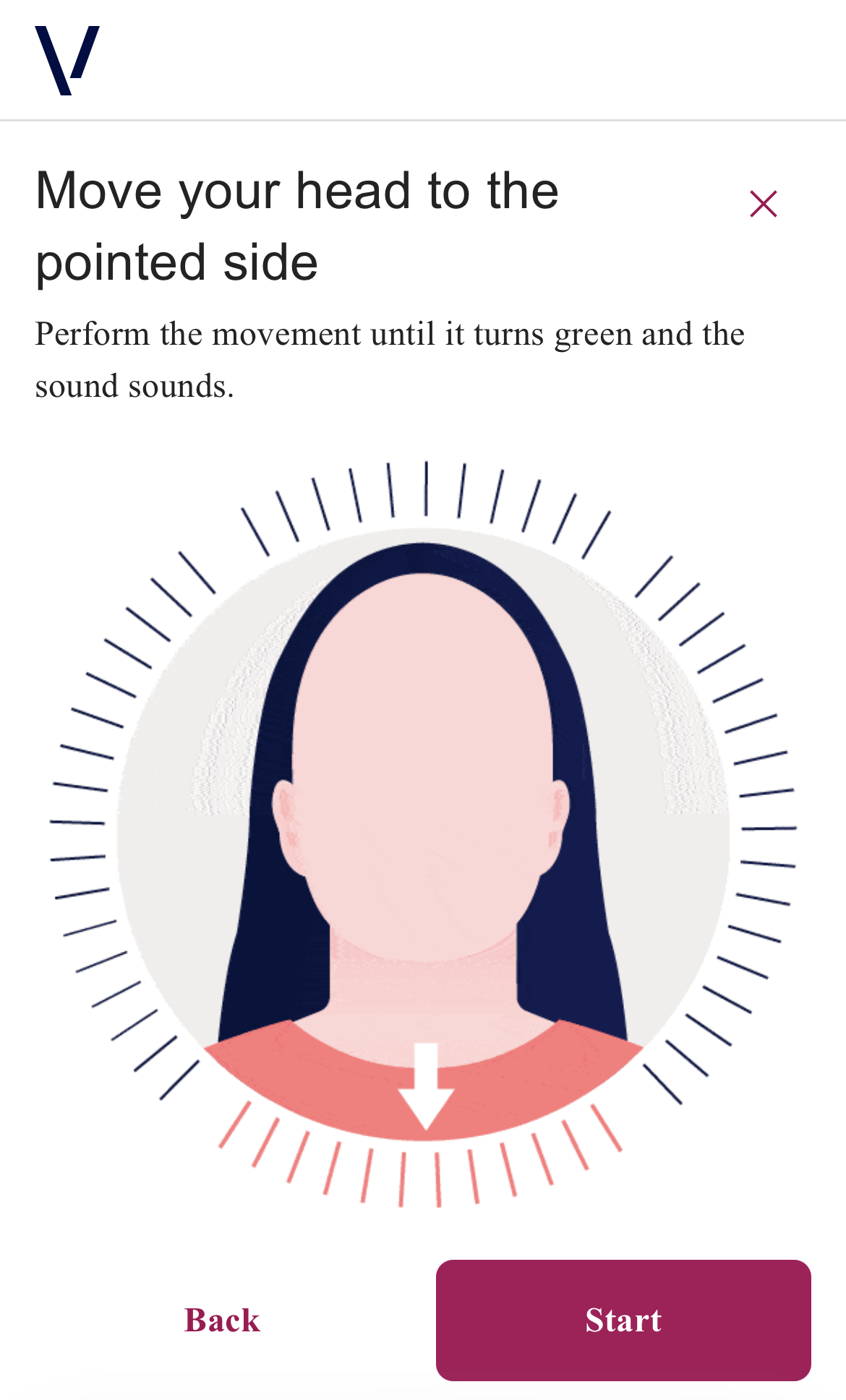 |
| Loading Capture | 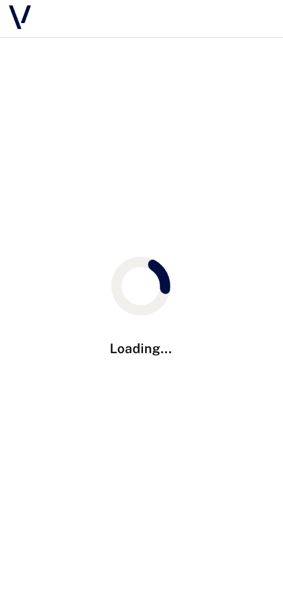 |
 |
| Capture Passive | 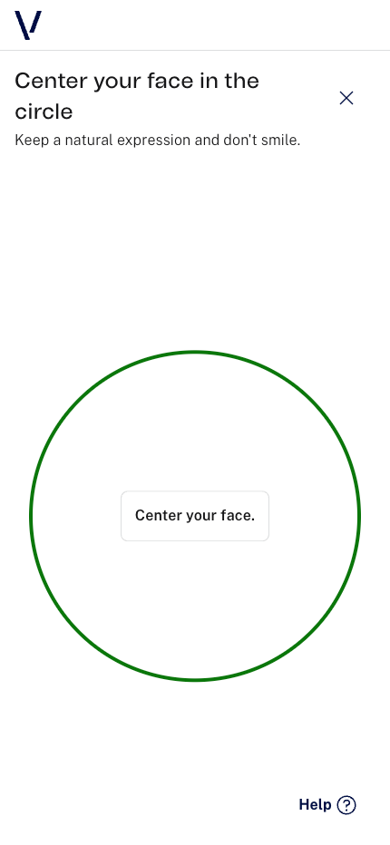 |
 |
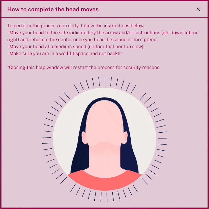
| Capture Passive (help modal) | 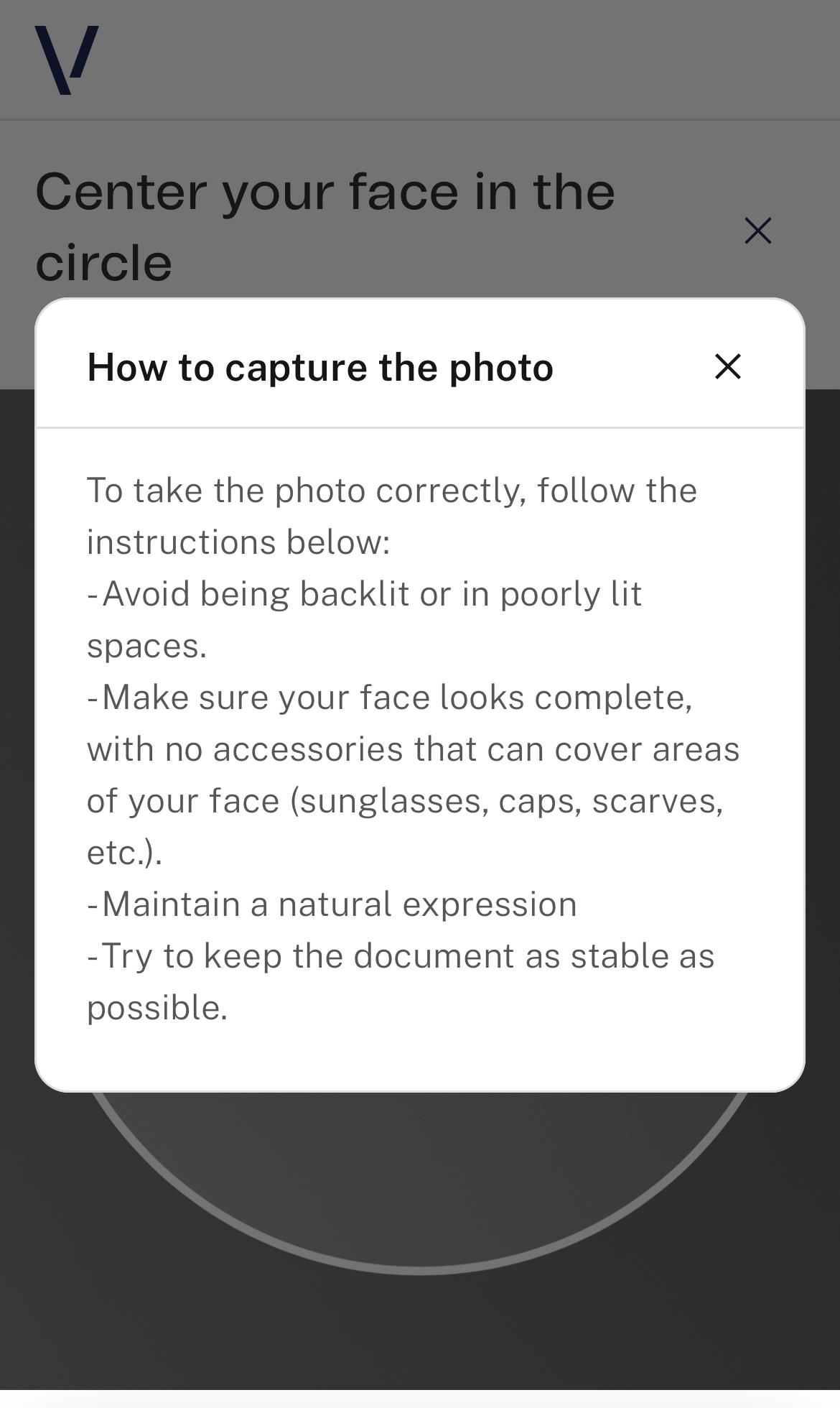 |
 |
| Capture Active | 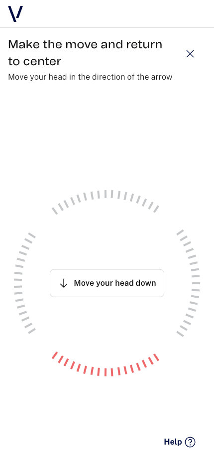 |
 |
| Capture Active (help modal) | 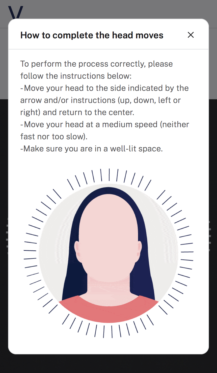 |
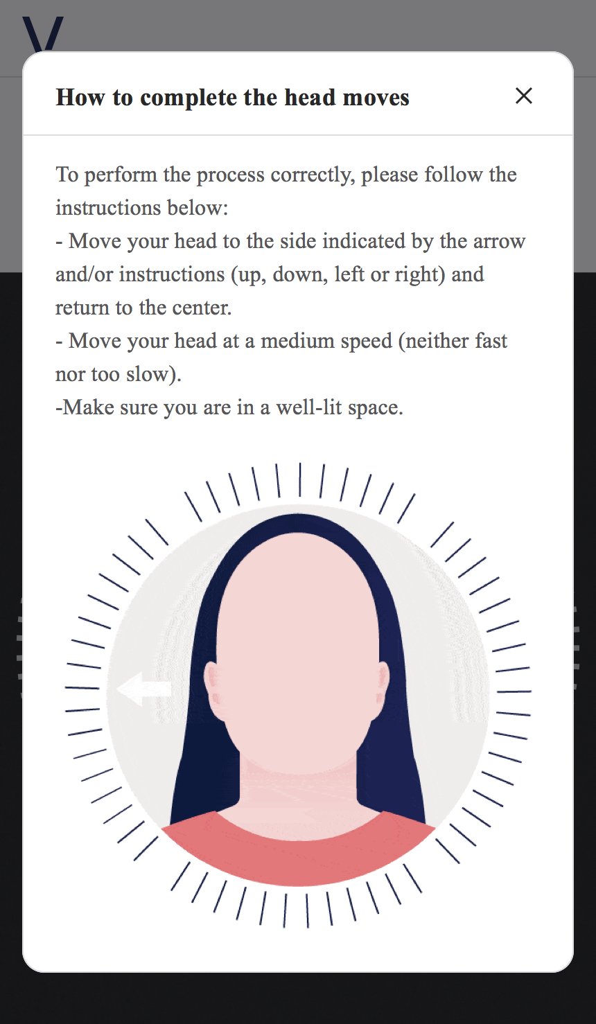 |
| Review (passive) | 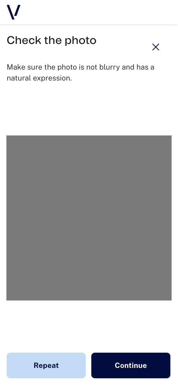 |
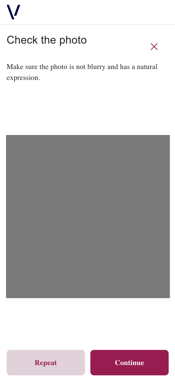 |
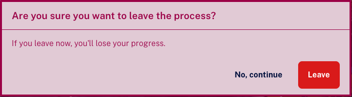
| Exit confirmation modal | 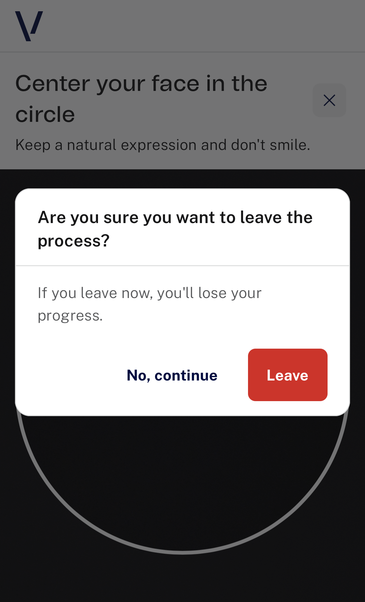 |
 |
| Error Permissions | 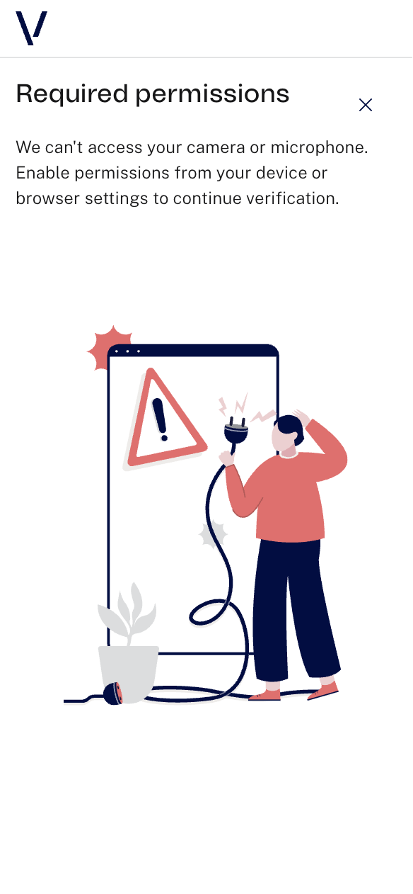 |
 |
| Error Verification | 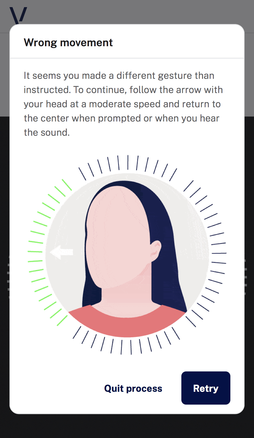 |
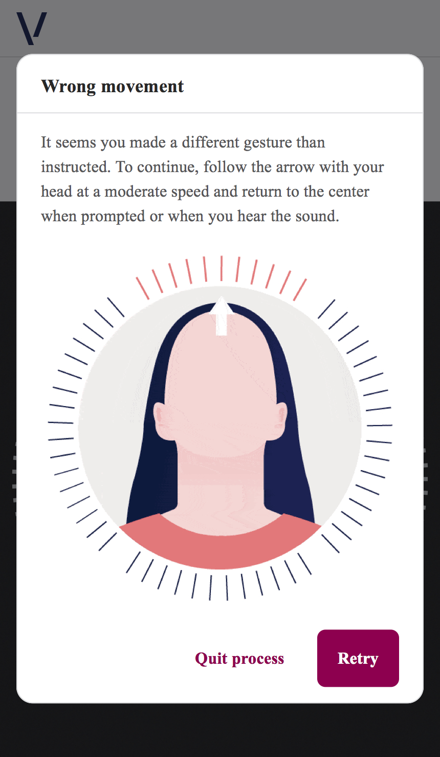 |
| Error No Movement | 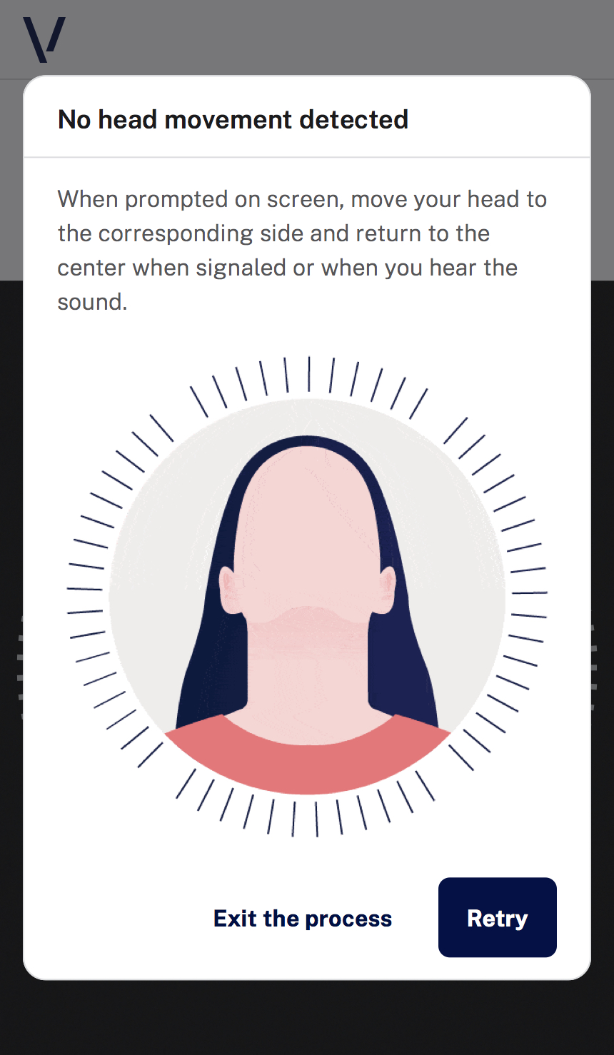 |
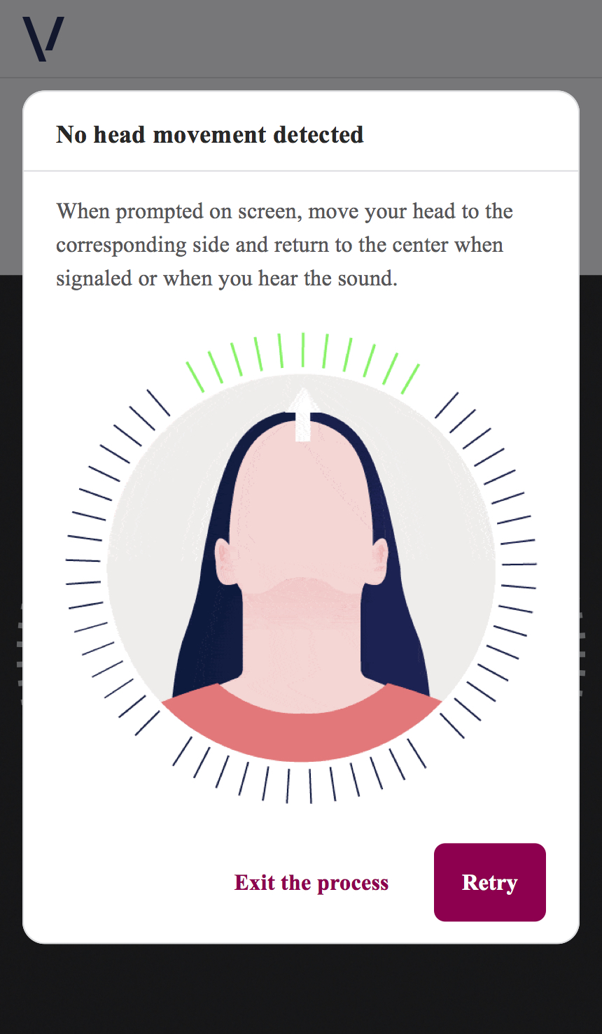 |
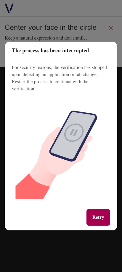
| Focus Error | 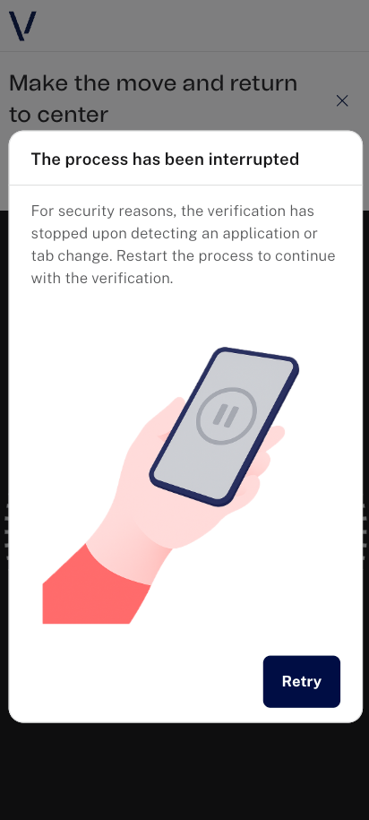 |
 |
Component Level
This level allows overriding specific components while preserving global theme defaults.
Header
The Header appears at the top of the screen and contains the logo (medias.logo and medias.logoSmall).
| Screen | Mobile |
|---|---|
| Header |  |
| Parameter | Description |
|---|---|
borderColor |
Border color |
borderWidth |
Border width |
backgroundColor |
Background color |
Example:
"styles": {
    "components": {
        "header": {
            "backgroundColor": "#E5D0DA",
            "borderColor": "#A50050",
            "borderWidth": "15px"
        }
    }
}

Button
General
The button component supports fine-grained control for:
- Background color
- Border color
- Border width
- Label/icon color
- Border radius
Button variants:
- Primary button
- Secondary button
- Tertiary button
- Tertiary inverse button
borderRadius applies across all button variants.
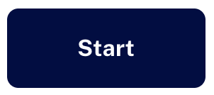
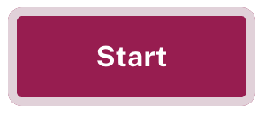
Primary Button
Used for primary actions (start/continue).
| Parameter | Description |
|---|---|
backgroundColorPrimary |
Background color |
labelColorPrimary |
Label color |
borderColorPrimary |
Border color |
borderWidthPrimary |
Border width |
Example:
"styles": {
    "components": {
        "button": {
            "backgroundColorPrimary": "#A50050",
            "labelColorPrimary": "#FFFFFF",
            "borderColorPrimary": "#E5D0DA",
            "borderWidthPrimary": "5px",
            "borderRadius": "15px"
        }
    }
}
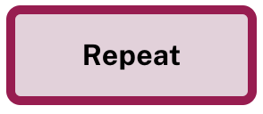
Secondary Button
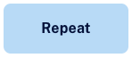
Used for secondary actions (repeat).
| Parameter | Description |
|---|---|
backgroundColorSecondary |
Background color |
labelColorSecondary |
Label color |
borderColorSecondary |
Border color |
borderWidthSecondary |
Border width |
Example:
"styles": {
    "components": {
        "button": {
            "backgroundColorSecondary": "#E5D0DA",
            "labelColorSecondary": "#000000",
            "borderColorSecondary": "#A50050",
            "borderWidthSecondary": "5px",
            "borderRadius": "15px"
        }
    }
}
Tertiary Button
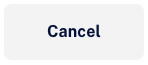
Used for cancel/help/exit related actions.
| Tertiary | Tertiary Inverse |
|---|---|
 |
 |
| Parameter | Description |
|---|---|
backgroundColorTertiary |
Background color |
iconColorTertiary |
Icon color |
labelColorTertiary |
Label color |
borderColorTertiary |
Border color |
borderWidthTertiary |
Border width |
backgroundColorTertiaryInverse |
Background color (inverse) |
iconColorTertiaryInverse |
Icon color (inverse) |
labelColorTertiaryInverse |
Label color (inverse) |
borderColorTertiaryInverse |
Border color (inverse) |
borderWidthTertiaryInverse |
Border width (inverse) |
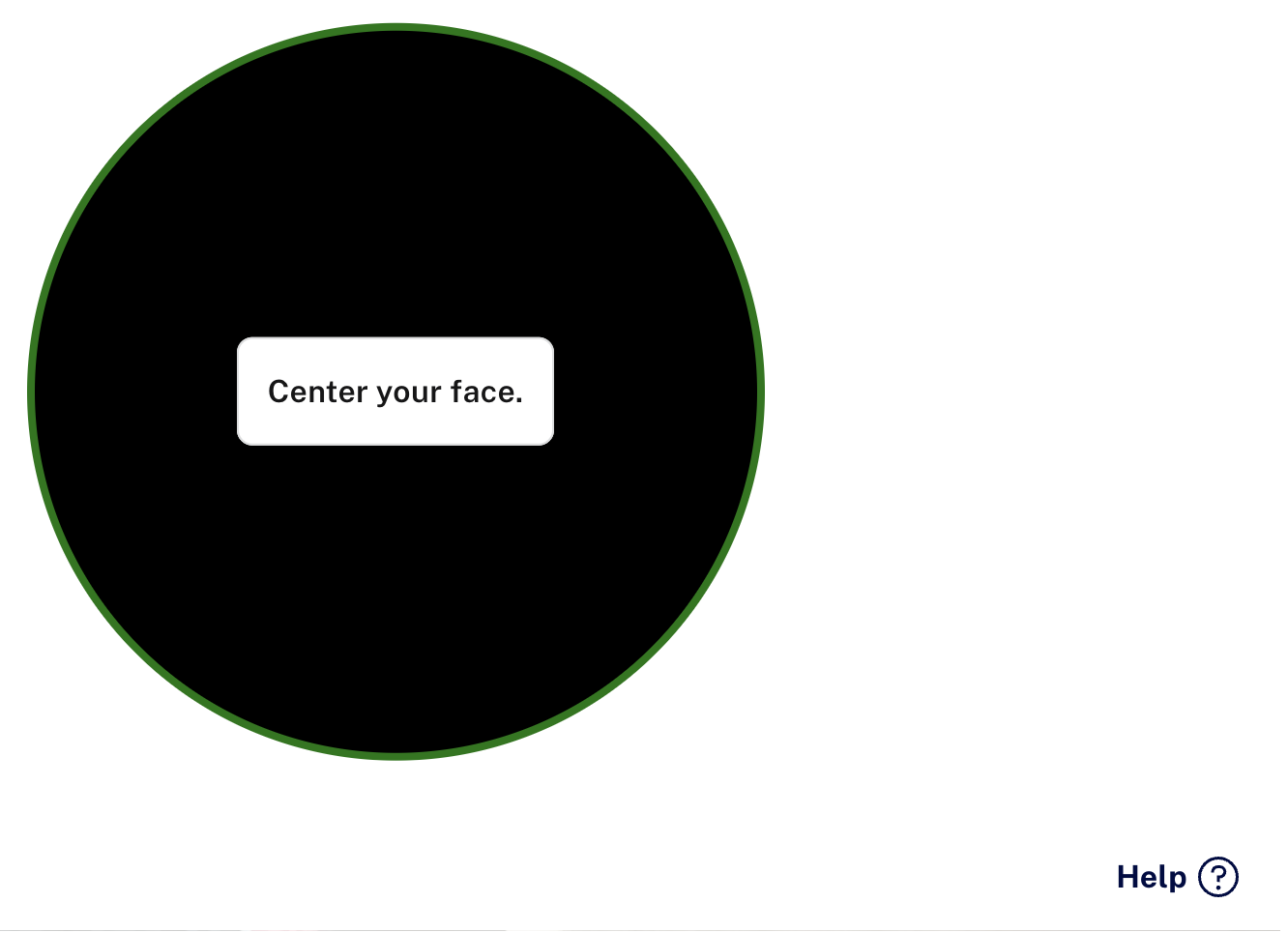
The help button uses default/inverse style depending on capture state.
| Tertiary help (detection) | Tertiary help inverse (no detection) |
|---|---|
 |
 |
Example:
"styles": {
    "components": {
        "button": {
            "backgroundColorTertiary": "#F3F6FB",
            "iconColorTertiary": "#6D4C41",
            "labelColorTertiary": "#6D4C41",
            "borderColorTertiary": "#BCAAA4",
            "borderWidthTertiary": "5px",
            "backgroundColorTertiaryInverse": "#F7EAF2",
            "iconColorTertiaryInverse": "#C2185B",
            "labelColorTertiaryInverse": "#C2185B",
            "borderColorTertiaryInverse": "#F8BBD0",
            "borderWidthTertiaryInverse": "5px",
            "borderRadius": "15px"
        }
    }
}
| Tertiary | Tertiary Inverse |
|---|---|
 |
 |
Interactive states (Button)
The SDK allows customization of hover/pressed states through generic overlays and specific per-variant keys.
Generic overlay keys:
colorDefaultHovercolorDefaultPressedcolorInverseHovercolorInversePressed
Specific interactive keys (styles.components.button.interactiveStates):
| Parameter | Description |
|---|---|
backgroundColorPrimaryHover |
Background color when hovered |
backgroundColorPrimaryPressed |
Background color when pressed |
labelColorPrimaryHover |
Label color when hovered |
labelColorPrimaryPressed |
Label color when pressed |
borderColorPrimaryHover |
Border color when hovered |
borderColorPrimaryPressed |
Border color when pressed |
borderWidthPrimaryHover |
Border width when hovered |
borderWidthPrimaryPressed |
Border width when pressed |
backgroundColorSecondaryHover |
Background color when hovered |
backgroundColorSecondaryPressed |
Background color when pressed |
labelColorSecondaryHover |
Label color when hovered |
labelColorSecondaryPressed |
Label color when pressed |
borderColorSecondaryHover |
Border color when hovered |
borderColorSecondaryPressed |
Border color when pressed |
borderWidthSecondaryHover |
Border width when hovered |
borderWidthSecondaryPressed |
Border width when pressed |
backgroundColorTertiaryHover |
Background color when hovered |
backgroundColorTertiaryPressed |
Background color when pressed |
iconColorTertiaryHover |
Icon color when hovered |
iconColorTertiaryPressed |
Icon color when pressed |
labelColorTertiaryHover |
Label color when hovered |
labelColorTertiaryPressed |
Label color when pressed |
borderColorTertiaryHover |
Border color when hovered |
borderColorTertiaryPressed |
Border color when pressed |
borderWidthTertiaryHover |
Border width when hovered |
borderWidthTertiaryPressed |
Border width when pressed |
backgroundColorTertiaryInverseHover |
Background color inverse when hovered |
backgroundColorTertiaryInversePressed |
Background color inverse when pressed |
iconColorTertiaryInverseHover |
Icon color inverse when hovered |
iconColorTertiaryInversePressed |
Icon color inverse when pressed |
labelColorTertiaryInverseHover |
Label color inverse when hovered |
labelColorTertiaryInversePressed |
Label color inverse when pressed |
borderColorTertiaryInverseHover |
Border color inverse when hovered |
borderColorTertiaryInversePressed |
Border color inverse when pressed |
borderWidthTertiaryInverseHover |
Border width inverse when hovered |
borderWidthTertiaryInversePressed |
Border width inverse when pressed |
Icon button
Icon button is used for icon-based actions (close). Changes apply globally where icon button is used.

| Parameter | Description |
|---|---|
backgroundColorTertiary |
Background color |
iconColorTertiary |
Icon color |
borderColorTertiary |
Border color |
borderWidthTertiary |
Border width |
borderRadius |
Border radius |
colorHover |
Hover overlay |
colorPressed |
Pressed overlay |
Interactive state keys (styles.components.iconButton.interactiveStates):
backgroundColorTertiaryHoverbackgroundColorTertiaryPressediconColorTertiaryHovericonColorTertiaryPressedborderColorTertiaryHoverborderColorTertiaryPressedborderWidthTertiaryHoverborderWidthTertiaryPressed
Example:
"styles": {
    "components": {
        "iconButton": {
            "backgroundColorTertiary": "#FFFFFF",
            "iconColorTertiary": "#A50050",
            "borderColorTertiary": "#A50050",
            "borderWidthTertiary": "2px",
            "borderRadius": "8px",
            "colorHover": "#E5D0DA",
            "colorPressed": "#A50050",
            "interactiveStates": {
                "backgroundColorTertiaryHover": "#F5F5F5",
                "backgroundColorTertiaryPressed": "#E5D0DA",
                "iconColorTertiaryHover": "#A50050",
                "iconColorTertiaryPressed": "#E5D0DA",
                "borderColorTertiaryHover": "#E5D0DA",
                "borderColorTertiaryPressed": "#A50050",
                "borderWidthTertiaryHover": "2px",
                "borderWidthTertiaryPressed": "4px"
            }
        }
    }
}
Spinner
Spinner styles are configured at styles.components.spinner.
| Parameter | Description |
|---|---|
containerColor |
Spinner container color |
progressColor |
Spinner progress color |
Example:
"styles": {
    "components": {
        "spinner": {
            "containerColor": "#E5D0DA",
            "progressColor": "#A50050"
        }
    }
}
| Default | Modified |
|---|---|
 |
 |
Modal references (theme-level impact)
| Screen | Default | Modified |
|---|---|---|
| Help modal (capture) | 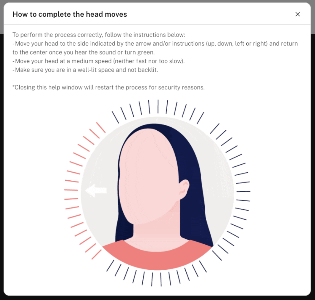 |
 |
| Exit confirmation modal | 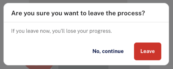 |
 |